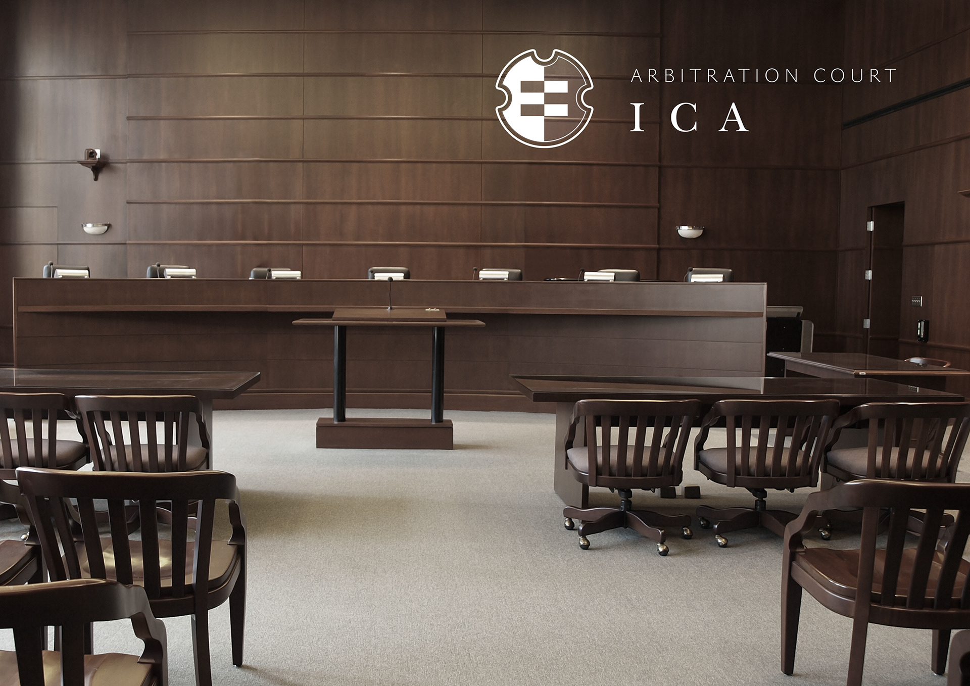

Logo and identity for arbitration court "Independent Chamber of Arbitration" (ICA). ICA's identity bears strong symbolism which is clearer perceived emotionally than rationally. ICA's trademark looks like modern version of a heraldic shield, but it's loaded with meaning, as well as all the other elements of the identity: intricate background pattern signifies trial complexities, twists and turns, contrast of light and dark stands for competition of the parties in trial, accented verison of the logo encased in a framed square is meant to represent final paramount verdict, extensive usage of grey or silver implies neutrality and impartiality of the court.

